Welcome to Art with Mrs. French

I've put together this site to showcase some of the wonderful art work my students are creating. Take a look around and enjoy!

We Are Art Smart!

Howard Gardner, Ph.D., professor at Harvard University, first identified seven different kinds of intelligence in his classic book Frames of Mind. His theory has challenged assumptions about intelligence and learning and deeply influenced the path of education in the United States.

Gardner identifies Spatial intelligence as the ability to "think in pictures," to perceive the visual world accurately, and recreate (or alter) it in the mind or on paper. Spatial intelligence is highly developed in artists, architects, designers and sculptors. When we create art, thinking and acting to increase and develop our spatial intelligence, we become Art Smart!

Click here for an interesting article from ARTSEDGE on why being Art Smart is an important 21st century workplace skill.

About me

Julie French

I started my career in advertising as a graphic designer working with some very interesting businesses and non-profits. Click here to see some of that work. After taking time off to start a family, I wanted to combine my two loves — children and art. I'm now in my eighth year teaching art and I love it! My students' creativity amazes me every day, they are a joy to work with.

Contact Me

Parents may reach me through our school website, everyone else please email juliefrench@mac.com.

Friday
Dec062013

Social Justice Calligrams

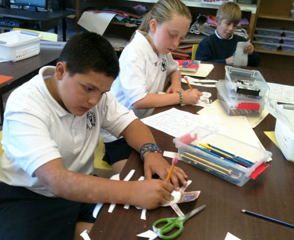
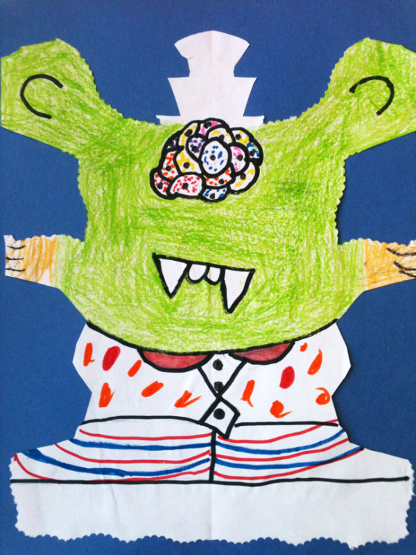
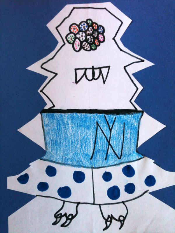
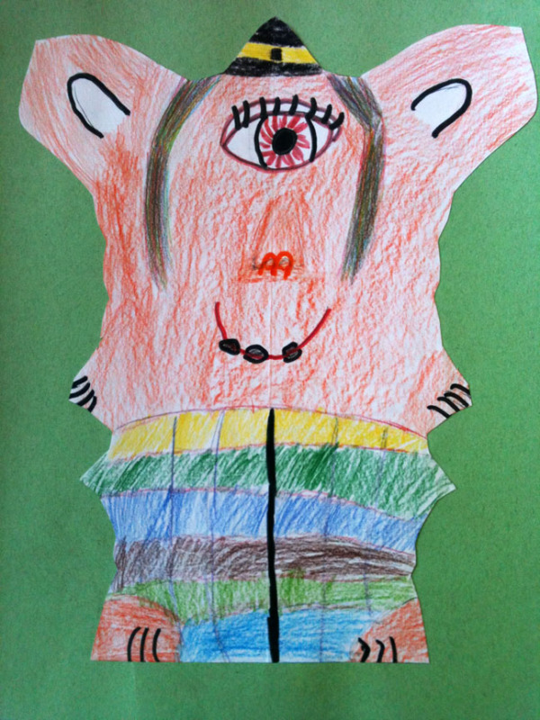
The subjects of Art, Literature and Language Arts came together for this project our 8th grade students have just completed. Social Justice is a major theme in Mrs. Panzo's Literature and Language arts classes this year, where students have been researching and writing about the topic in a variety of challenging projects.

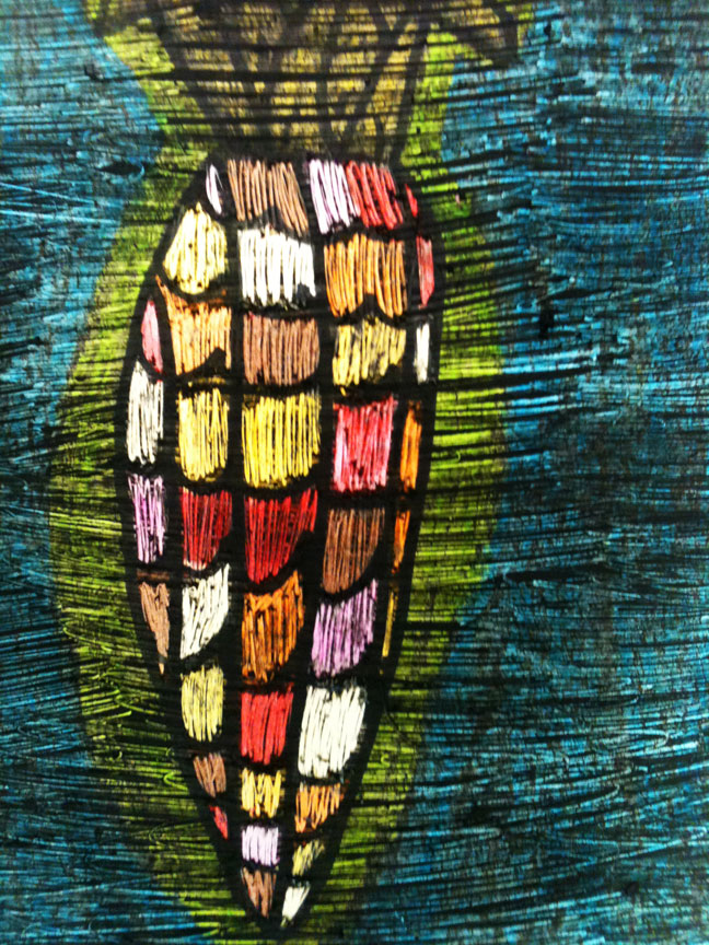
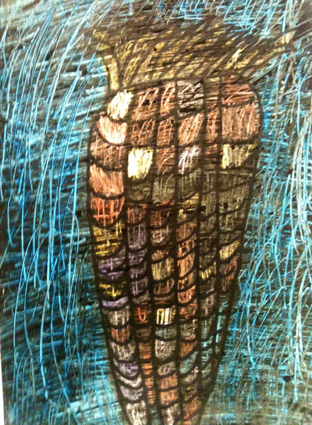
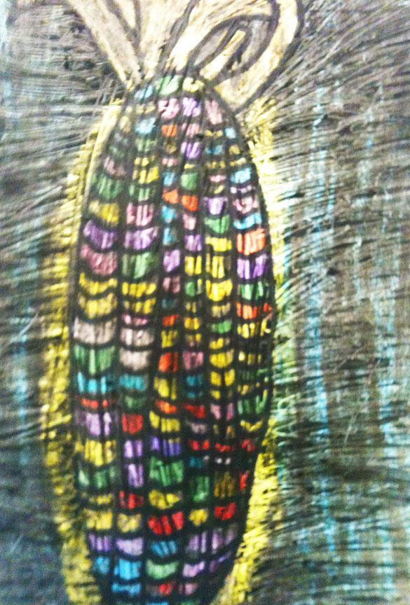
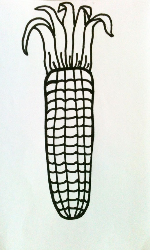
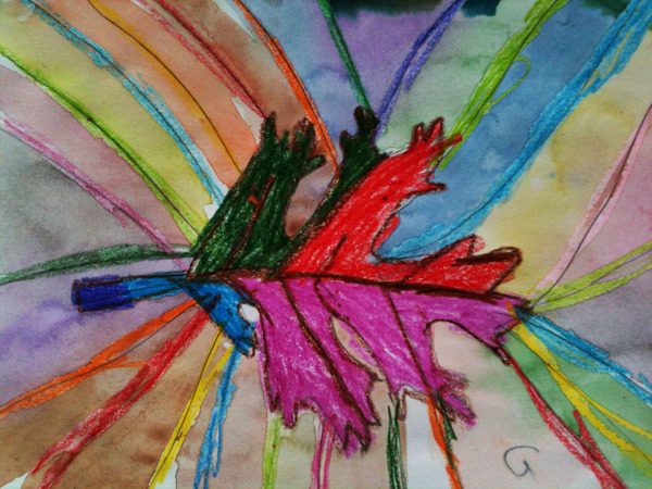
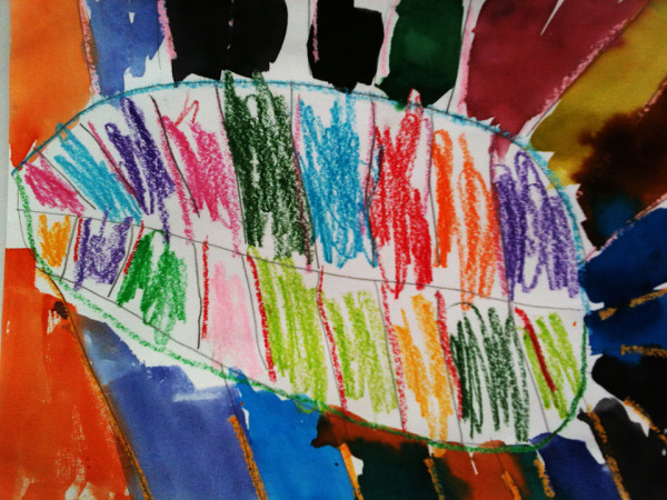
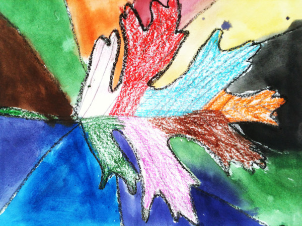
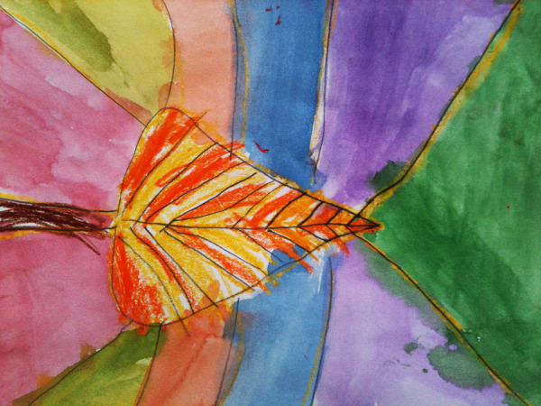
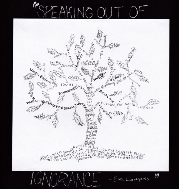
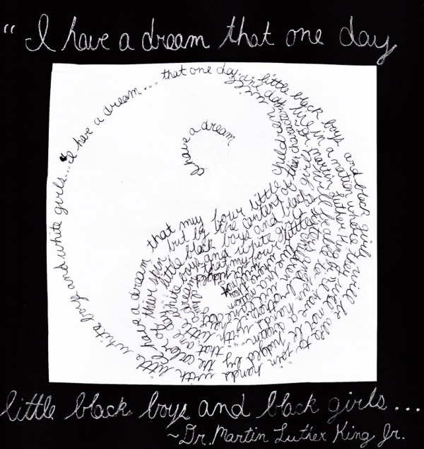
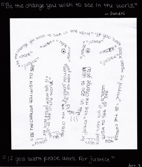
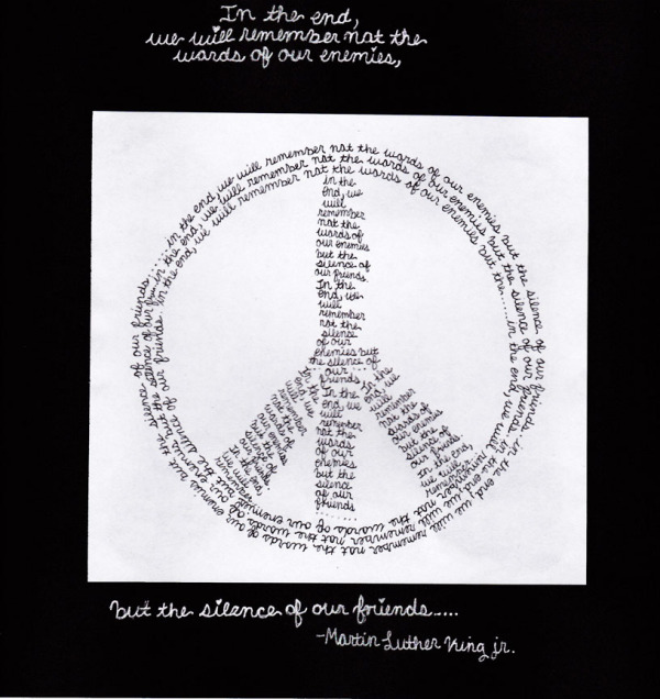
They applied that knowledge for this art project by developing a favorite quote or writing by an important figure they had studied into a calligram. Calligrams use a word or piece of text to create a visual image related to the meaning of the words themselves. Students could also choose the alternative of developing a poem about themselves and their interests they had written into a calligram. In the art room we stressed that the visual image relate well to the text, and that the words vary in size and thickness when needed to create visual interest. Students were excited to bring this important theme into their art, and I think the results are stunning, don't you? Find more examples by clicking on any image below.


Friday
Dec062013

Line Paintings

Line is the most basic of the elements of art that artists use everyday in their work. Our kindergarten and first grade class had fun with this project as they explored different types of lines. After a whiteboard review of all the types of lines they could think of, students used crayon to draw at least five different types across their 12" by 18" paper. They then filled in the spaces between the lines using watercolor paints. This gave us a chance to talk about how to use watercolors, how to best achieve a variation of tints with them and how to keep the green paint out of the yellow (wash off your brush!) Below are some of the beautiful results, click on any to see more line paintings.

Friday
Dec062013

Monochromatic Monsters!

Using tempera paint in only one color plus white, our 2/3 students created these monochromatic monsters. It was a good way to learn about hues, tints and shades in art and how artists can mix colors both on a palette and right on their paintings. The added bonus: monsters are FUN to make! Clicking on any image brings you to the monster gallery.

Friday
Dec062013

Sgraffito Thanksgiving Corn


Sgraffito,  (Italian: “scratched”), in the visual arts, a technique used in painting, pottery, and glass, which consists of putting down a preliminary surface, covering it with another, and then scratching the superficial layer in such a way that the pattern or shape that emerges is of the lower colour. - from the Encyclopedia Britannica


Sgraffito is a very old technique our 4/5 students used to create these Thanksgiving Indian corn pieces. After using simple lines to draw an ear of corn with black sharpie, students colored in the corn with crayon in warm, bright colors. Backgrounds used complementary colors (opposite on the color wheel) to create a strong contrast. A layer of thick black oil pastel then covered the entire piece. Imagine how hard that was to do; covering your brightly colored artwork with black pastel! Yet that step is what makes this technique possible. Using a pointed wooden stick, the top layer is scraped of to reveal the color beneath. The best results are achieved when the direction of the scratches are varied to create visual interest. (Thanks to Kathy Barbro at Art Projects for Kids for this project idea.)

Step 1Step 2

Step 3

Thursday
Nov142013

Chalk and Glue Autumn Leaves

Here's another leaf project inspired by our beautiful New England landscape. This time we added a twist by drawing leaf shapes in glue on black construction paper. It was easier than it might sound if you've never done it before. The trick is to use only perfectly unclogged bottles of glue. That required a thorough cleaning of 22 bottles of much-used school glue, but the results are worth the time spent. After practicing a bit to ensure steady hands, our students drew their favorite leaf shape taken from the piles we had available to view.

(Luckily, there is no shortage of leaves right now in my yard!)


After the glue dried clear, only black lines remained. Students then selected two to three colors of chalk pastels to add to the leaves, blending the colors as they went. If they could see the black paper after blending, they added more chalk. The last step was to color the backgrounds using complementary colors, or colors on the opposite side of the color wheel from their leaf colors. Doing this creates the most contrast and made their leaves really "pop" off the page. Many of the pieces show the intense color chalk pastels are capable of, and some show off more delicate color schemes. I think they are all spectacular. Click on any image to see more of these beautiful designs.

Thursday
Nov142013

Colorful Crayon Resist Leaves

Fall in New England is such a visual delight that it always inspires terrific art projects. Our 2/3 class studied oak, birch and maple leaves, and used them to create these gorgeous pieces. They first drew their favorite leaf on black paper using crayon, carefully following their leaf outline and being sure to add the veins. I asked them to also draw some straight lines out from their leaves to the edge of the paper to break up the background. After adding their choice of colors to the inside of the leaf, they used watercolor paint to fill in the background spaces. The crayon lines "resist" the watercolor. Aren't the results beautiful? Click on any image to see more leaves.

Save & Close

Thursday
Nov142013

Fuzzy Spiders

Our K/1 class learned how to draw a spider web by criss-crossing four lines in the center of their paper, then connecting them with ever-widening circles that looped around the center point. They used a range of colors to decorate their web, then created fuzzy spiders to dwell within them. Click on the image to see more fuzzy friends!

Thursday
Nov142013

Pop-Up Haunted Houses

Pop-up construction is always fun for students to create. Using just a bit of construction paper, a few strategic folds and cuts and some creativity, these haunted houses came to life in our art room for Halloween. Click on any image to see more spooky shacks.

Friday
Oct182013

Abstract Name Art

The beginning of the new school year is a good time to incorporate student names into art work, and this year our grade 6, 7 and 8 classes turned their names into abstract art. Abstract art does not attempt to represent external, recognizable reality but achieves its effect using shapes, forms, colors, and textures.

 Le Premier DisqueRobert Le Delaunday 1912-13                       Homage to the Square, Josef Albers


 To create their art, students followed three steps. They first drew their names in black sharpie marker to fit into an 8" x 8" square. Next, they cut the names into 16 two inch squares and rearranged those squares in an interesting way. While designing their composition students considered principles of design such as variety and harmony, balance, emphasis, pattern, rhythm and movement. When they were happy with their compositions, students colored their art using analogous colors. Using colors next to each other on the color wheel helped unify their finished pieces. 

Take a look at how following these three simple steps produced a variety of terrific abstract art. Clicking on any image below brings you to a gallery of more work to see.

Step One, Step 2, Step 3


Friday
Oct182013

Name Monsters!

sym·me·try

noun \ˈsi-mə-trē\

: the quality of something that has two sides or halves that are the same or very close in size, shape, and position : the quality of having symmetrical parts

Our 4/5 class used the concept of symmetry (the above definition from the Merriam Webster online dictionary) to create these very cool Name Monsters. First step was to fold an 8" x 10" paper in half and write their name in cursive along the bottom fold. With the paper still folded, students cut all around the top and sides of their name, leaving the bottom fold intact.After opening the cut paper each student had a unique shape with which to fashion their own monster.

Working with marker, crayon or colored pencil our artists added facial features, clothes and anything else appropriate to their funny, sad or scary monsters. Take a look below. Clicking on any image takes you to more monsters!